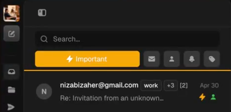
More contrast is needed in the category buttons💡Feature RequestMay 1, 2025The category buttons could probably use a little bit more contrast (currently light text on a medium/light background)Posted by Brandon McConnell · May 1, 2025Status: Completed2 comments2
Log in to comment and vote
Comments2
Nizar
May 3, 2025
light mode has been fixed!
Oscar May
May 3, 2025
on light mode, the icons dont change, so you cant see them